Selected workBrand identity / DeFi / 2026
Hanami
An identity shaped by growth.

My role
Brand identity · Visual system
What's included
- Symbol & wordmark
- Typography & colour
- Logo applications
- Brand imagery
The project
Hanami is a yield protocol named after the Japanese tradition of appreciating flowers. The identity connects that idea of patient growth with a fluid, petal-shaped symbol, a confident wordmark and a blue-led visual world.
From a flower to a flexible identity.
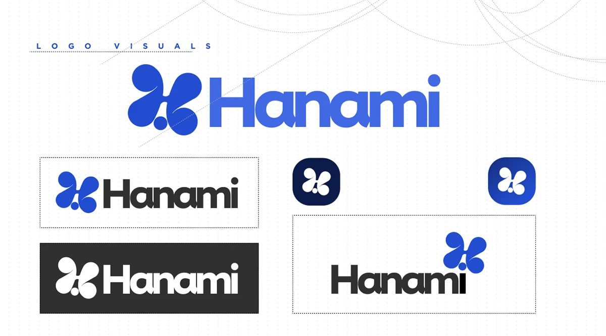
The symbol’s rounded petals echo an H without becoming a literal flower illustration. A compact wordmark anchors the organic shape; colour, type and image treatment carry the idea into a wider system. The presentation shows the identity in full lockups, standalone symbols and small app-icon formats.
The work, in detail
04 selected visuals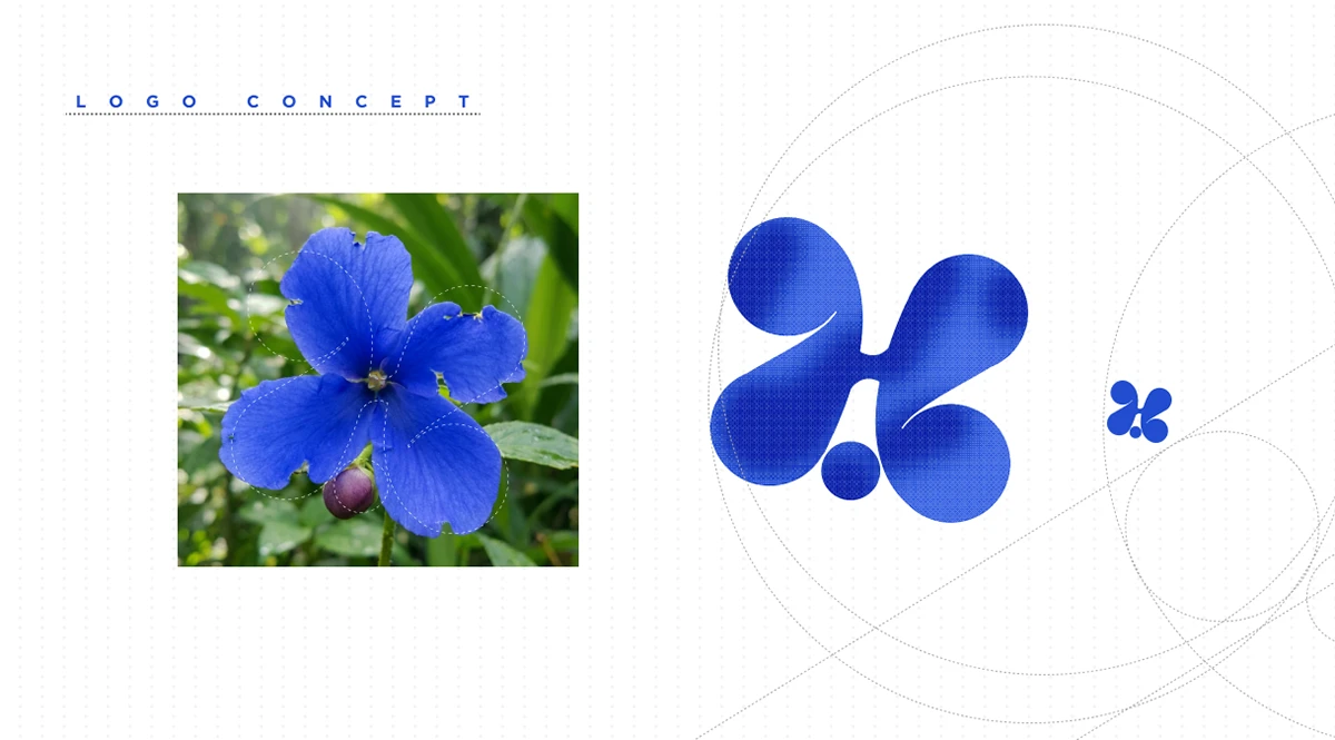


Next project
Cashi